Paper Comparison
Hot Press vs Cold Press vs Rough Watercolor Paper
Surface texture changes the brush mark itself. Choose hot press for smooth precision, cold press for balanced versatility, or rough when the paper grain should visibly participate in the painting.
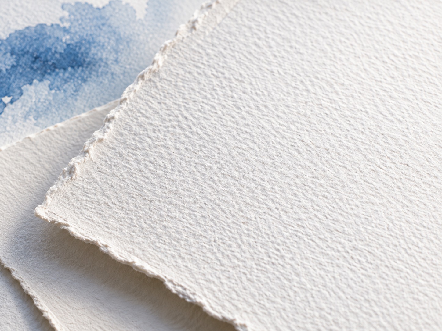
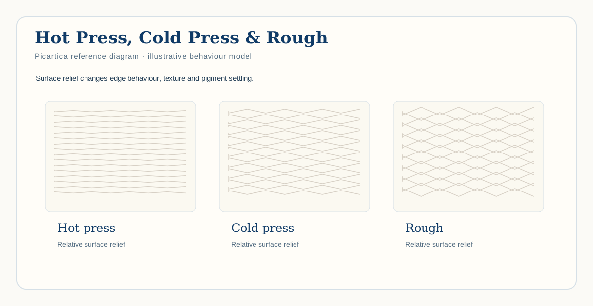
Hot press is the smoothest, cold press provides moderate texture, and rough has the most pronounced grain. None is universally best; the right surface depends on the marks you want.
Hot press watercolor paper
Hot press is the smoothest of the common watercolor surfaces. The brush contacts the sheet more continuously, making it useful when you want crisp lines, small detail, controlled drawing or pen-and-wash work.
The smooth surface can also make water movement feel more obvious because paper grain contributes less visible breakup.
Cold press watercolor paper
Cold press sits in the middle. It has enough texture to interact visibly with watercolor without making every mark strongly broken or grainy.
That balance makes it a sensible first paper when you have no strong preference yet—not because it is objectively best, but because it supports a broad range of techniques.
Rough watercolor paper
Rough paper makes the surface part of almost every mark. Raised areas catch the brush while recessed areas can collect pigment, producing broken strokes and pronounced granulation.
This can be especially useful for stone, bark, sand, distant landscape textures and expressive passages. It can be less convenient when tiny precise details matter.
Dry brush across the three surfaces
Use the same brush and paint concentration, remove some moisture, and drag the side of the brush lightly across all three papers.
| Surface | Likely mark |
|---|---|
| Hot press | Comparatively continuous. |
| Cold press | Moderately broken. |
| Rough | Strong fragmentation across the raised grain. |
Which surface suits which work?
Botanical and line-heavy illustration often benefits from hot press. General watercolor and mixed techniques frequently sit comfortably on cold press. Rough can be powerful in landscapes and textural work. But subject does not dictate paper—technique does.
A better decision rule
- Want very little visible grain? Start with hot press.
- Want a versatile middle ground? Start with cold press.
- Want surface texture to actively participate? Try rough.
The texture is not decoration on watercolor paper. It changes how brush, water and pigment meet the sheet.
Sources & verification
Core technical claims in this article were checked against the sources below. Picartica test protocols, editorial judgments and recommendations remain clearly separate from manufacturer claims.
- Canson — Selecting your watercolor paperManufacturer education
GSM definition, lighter-paper buckling, 300 gsm as a general compromise, paper textures and blocks. - ARCHES — Aquarelle paperManufacturer
100% cotton, gelatin sizing to the core, cold/hot/rough textures, weights, lifting and limited deformation. - Fabriano — Artistico watercolor paperManufacturer
100% cotton mould-made paper, 300/640 gsm, multiple surfaces and improved surface sizing.
Verification status: core technical claims checked against the cited sources. Page structure, internal links and publication markup were re-audited for this release on 6 September 2026.